You are using an out of date browser. It may not display this or other websites correctly.
You should upgrade or use an alternative browser.
You should upgrade or use an alternative browser.
HOT OFF THE PRESS!!!!! New Canuck uni's!!
- Thread starter Argyle
- Start date


johnnybluenose
Well-Known Member
They are disgusting
The Salmons were vastly underrated.
The Salmons were vastly underrated.
johnnybluenose
Well-Known Member
Anything here(for the most part) would have been waaaay better
Picasa Web Albums - Chris - Vancouver Can...
Picasa Web Albums - Chris - Vancouver Can...
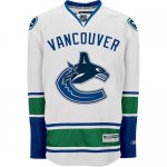
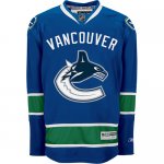
The orca and c being a different colour than the blue and green scheme really bugs me, it doesn't look professionial at all. Not a big fan of the giant VANCOUVER lettering either. Very disappointed considering all the hype I expected a lot better.
The Vancouver over the logo is bizarre. Can't think of any other jersey that has a logo and the name of the city on it. Agreed about the blues being better than the whites, the strip of green on the whites with blue lettering and a blue logo looks weird. Lots of hype but a bit of a letdown.
johnnybluenose
Well-Known Member
Apparently the reason for the big VANCOUVER in garbage font arched over the logo is to sell millions of dollars worth to the tourists leading up to, and during, the Olympics, apparently they buy anything and everything with the host cities name on it...including pro sports teams uniforms...
Terrible, and to think they spent a million bucks having this thing designed and trademarked (heard that on the TEAM)
I would have come up with a better one for free, or maybe a seasons ticket or two...
Terrible for sure.
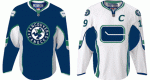
The Whale, while westcoast, doesn't reflect 'Canuck' at all, whether the moniker 'Canuck' refers to a Canadian Comic Book Character, A lumberjack of French Canadian Heritage on the West Coast, or to what the Euros referred to the Candian Troops as during the world wars...a whale jumping out of ice representing the name is simply bad. Colours and design, full marks, the freshening up of the old stick logo on the shoulders, full marks. The birthing/puking/stupid orca- repulsive, and they should have binned it straight away.
Terrible, and to think they spent a million bucks having this thing designed and trademarked (heard that on the TEAM)
I would have come up with a better one for free, or maybe a seasons ticket or two...
Terrible for sure.
The Whale, while westcoast, doesn't reflect 'Canuck' at all, whether the moniker 'Canuck' refers to a Canadian Comic Book Character, A lumberjack of French Canadian Heritage on the West Coast, or to what the Euros referred to the Candian Troops as during the world wars...a whale jumping out of ice representing the name is simply bad. Colours and design, full marks, the freshening up of the old stick logo on the shoulders, full marks. The birthing/puking/stupid orca- repulsive, and they should have binned it straight away.
Kevin Hector
Active Member
worst jersey ever
italian_stallion21
Well-Known Member
Well, the V's sucked pretty bad but these are definitely up there, hate basically everything everyone's said about them. The colour is about the only thing I like.
One Dart .. the Av's have that 3rd Burgundy Jersey with Colorado scrolled at a angle
the only teams that I think pulled it off are Pittsburgh and the Rangers (NY that is )
why do you have to advertise where your from by sewing it on your Jersey
Letter for Letter
isn't that what your Emblem supposed to do ?
Concerning the Orca breaking out of the Ice Upwards
it's alot better then the ice skate blasting downwards or the Techno colour yawn of the Big V ( which by the way .. to Boys who wore that Jersey
on the Ice back in 82.... bravest men I know )
Personally.. the simplicity of the Stick and Rink fit's ... the subtle updated one is alright as well
Those jersey's are brutal....flying v's were better
True true T-Idiot. Agreed that the Avs and Nucks don't pull that off.
If facebook is any measure, the number of people I know who have changed their status to something that mentions how ugly the jerseys are is quite a few.
Sad thing is, we moan about how bad they are here but they will still make millions from them (although I'm sure no one on TTP will buy one )
If facebook is any measure, the number of people I know who have changed their status to something that mentions how ugly the jerseys are is quite a few.
Sad thing is, we moan about how bad they are here but they will still make millions from them (although I'm sure no one on TTP will buy one
)Kevin Hector
Active Member
I'm not going to buy one fcuk that. this is the biggest joke of a Canucks Jersey. no wonder we are a joke of a team (other then here) people don't give a monkeys about this team east of Cranbrook. and having crappy jerseys and under acheiving teams is the reason why. I loved the Canucks but I'm so sick of there shite managment and the banwagon fans. this Jersey is a joke just like this team. and if anyone thinks they are going to make the playoffs or win a round if they do make it, give your haed a shake. Alex fcuking Burrows?????? what a joke. any team with him in the line up is a joke.
johnnybluenose
Well-Known Member
Why don't you tell us how you really feel?
Kevin Hector
Active Member
Sorry I lost it a little eh? lol oh well back to Burger King for me I'm hungry
johnnybluenose
Well-Known Member
So we are stuck with these (attached) vs what could have been, attached also.
Now that I have had a day to sleep on it...And think and stew about it...
I think these are the best uniforms the Nucks have ever had, but that isn;t saying a lot.
I was just expecting so much more...Johnny Canuck, or a totally new concept.
They did okay, it's not terrible like I instantly said yesterday, they have grown on me.
But theu missed a chance to swing for the fences...